Data Visualization Examples
## ── Attaching core tidyverse packages ──────────────────────── tidyverse 2.0.0 ──
## ✔ dplyr     1.1.4     ✔ readr     2.1.6
## ✔ forcats   1.0.1     ✔ stringr   1.6.0
## ✔ ggplot2   4.0.1     ✔ tibble    3.3.1
## ✔ lubridate 1.9.4     ✔ tidyr     1.3.2
## ✔ purrr     1.2.1
## ── Conflicts ────────────────────────────────────────── tidyverse_conflicts() ──
## ✖ dplyr::filter() masks stats::filter()
## ✖ dplyr::lag()    masks stats::lag()
## ℹ Use the conflicted package (<http://conflicted.r-lib.org/>) to force all conflicts to become errors
6.4 Background
Understanding how bird populations vary across different habitats and seasons is an important aspect of ecological research. In this homework, you will explore data collected from bird surveys conducted in three habitat types—Forest, Grassland, and Wetland—over four seasons. The dataset includes both the total bird count and the species richness (i.e., the number of different species observed) for each survey.
6.5 Data Description
You are provided with a CSV file named bird_survey_data.csv that contains the following columns:
Season: The season when the survey was conducted (e.g., “Spring”, “Summer”, “Fall”, “Winter”).
Habitat: The habitat type where the survey was carried out (“Forest”, “Grassland”, or “Wetland”).
Bird_Count: The total number of birds counted during the survey.
Species_Richness: The number of different bird species observed.
6.6 Tasks
Data Import & Preparation:
- Write an R script that reads the CSV file (
birds.csv) into a data frame.
- Write an R script that reads the CSV file (
## Rows: 12 Columns: 4
## ── Column specification ────────────────────────────────────────────────────────
## Delimiter: ","
## chr (2): Season, Habitat
## dbl (2): Bird_Count, Species_Richness
##
## ℹ Use `spec()` to retrieve the full column specification for this data.
## ℹ Specify the column types or set `show_col_types = FALSE` to quiet this message.
- Ensure the data types are correctly set (e.g., `Season` and `Habitat` should be treated as factors with a logical ordering for `Season`).Basic Visualization:
Use ggplot2 to create a grouped bar plot of Bird_Count versus Season.
Differentiate the three habitat types using different fill colors. Adjust the position so that bars for each season are grouped side by side.
ggplot(data = birds,
       mapping = aes(x = Habitat,
                     y = Species_Richness, fill = Season, group = Season)) + labs(x = "Habitat type") +
  geom_bar(stat = "identity", position = "dodge") + scale_fill_brewer(palette = 4)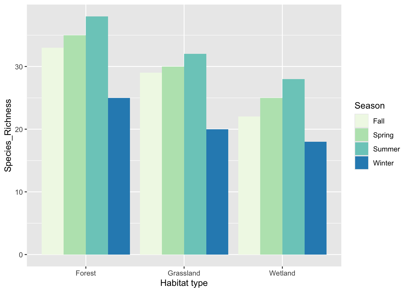
Enhanced Plot Features:
Customize your plot with informative axis labels (e.g., “Season” and “Bird Count”), a descriptive title, and a clear legend.
Apply an appropriate theme (e.g.,
theme_minimal()ortheme_classic()).
Optional Extension:
Create a second plot visualizing Species_Richness versus Season using a similar bar plot.
Alternatively, explore using facets (with
facet_wrap()) to compare both Bird_Count and Species_Richness across the different habitats in one multi-panel figure.
6.7 Setup for the Homework
Video introduction / help for homework
Hand in: a single pdf document with part 1 and part 2. Be sure that you explain why you chose the particular plots, and that the plots contain proper axis labels, formatting, etc.
Part 1.
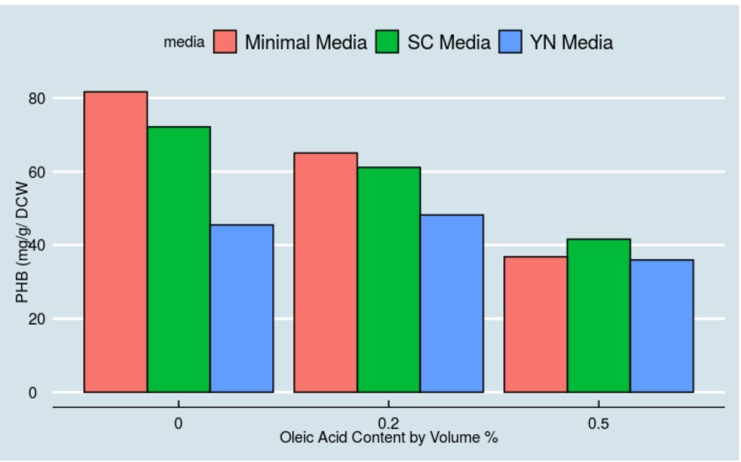
Dr. Senger is a Metabolic Engineer in our department; perhaps you’ll have him or had him for Thermo. His work includes developing biosensors, and he has a recent publication in Pubmed (see here). Imagine you’re an undergrad researcher in Dr. Senger’s group, and are asked to recreate Figure 2a from the publication within Rstudio. The raw data for the figure is available in the supplemental information, and in the Rstudio workspace for this week as an excel file (file contains data for all figures). Follow examples for bar graphs from the exercises (visualizing amounts).
You’ll want your final bar graph to look similar to this one, but you can choose the theme/color scheme. Below, I used theme_economist().
Part 2.
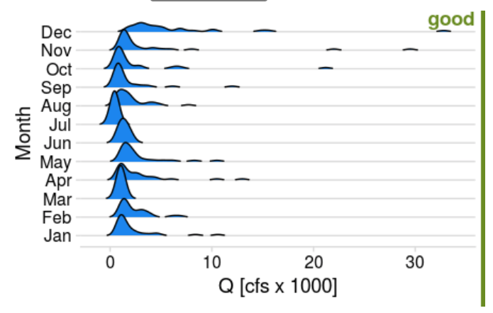
Dr. Shortridge is a Hydrologist in our department, and her work includes analyzing large hydrologic datasets. Here, imagine you’re asked to compare approaches for visualizing the distribution of monthly streamflow in 2020 for the Rappahannock River at Fredericksburg. Based on the distribution exercise, create a boxplot, violin plot, strip-jitter plot, and ridge plot. See the examples below for good and bad plots; you’ll want your plots to be “good”. Choose one figure that you like the best, and provide an explanation why.
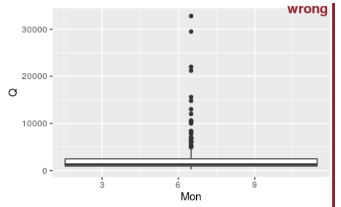
- Axis labels are just abbreviations and are missing units
- data does not make sense (e.g. not grouped by month)
- Ticks for y-axis are not between 0.1 - 100.
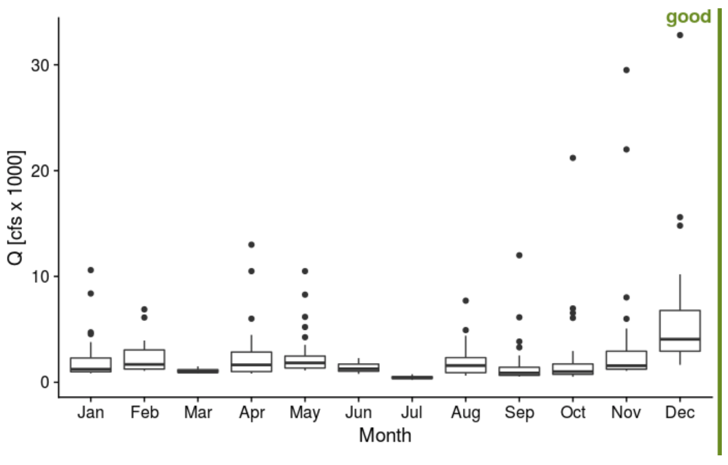
- Used simple theme in cowplot package
- Used x-variable in factor form (by using month function within lubridate and include label and abbr; type ?month)
- Normalized y-axis to 1000 :: aes (x = xvar, y =yvar/1000)
- Added group attribute in aes statement
- Added theme (e.g. theme_cowplot). Check out the cowplot package and ggthemes. There are many to choose from! Why do I like the theme above? Simple, axis labels slightly larger than tick labels, clear.
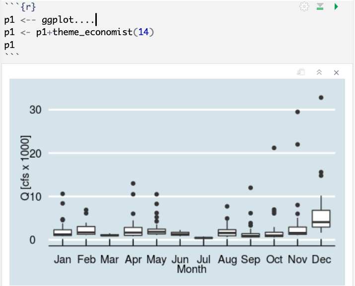
Here’s another example using theme_economist. When you create a plot, assign it a variable. Then you can easily change themes/attributes of the plot.
For your ridge-line plot, choose a fill color that you like. You add the fill color within the geom_density_ridges function (e.g. geom_density_ridges(rel_min_height = 0.01,fill="dodgerblue2"). A list of colors can be found here: http://www.stat.columbia.edu/~tzheng/files/Rcolor.pdf